SVG Component
Nandi
These components are sourced from Framer University.
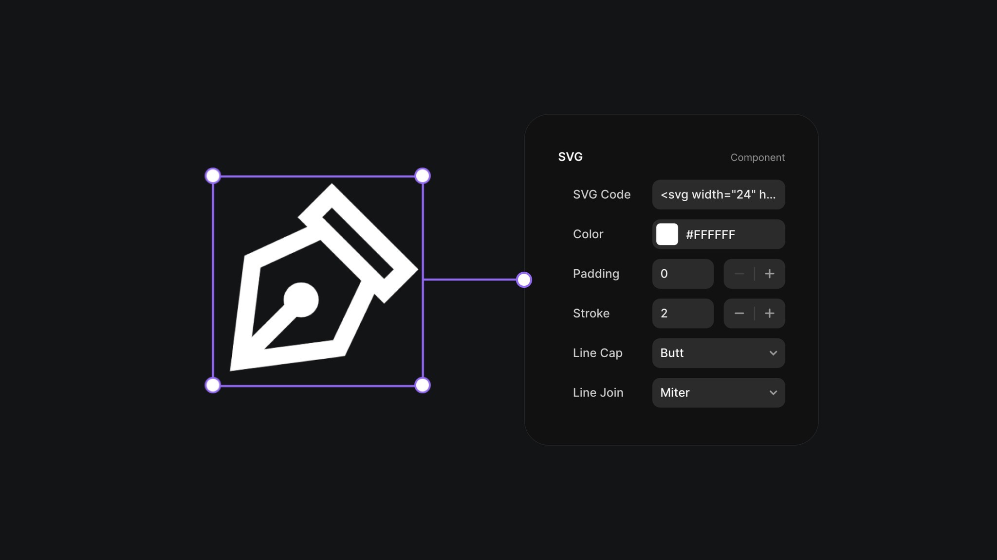
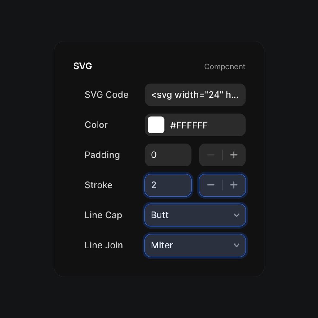
This SVG component in Framer simplifies the use of icons. Just paste the SVG code of your icon, and it will appear on the page. You can easily customize the color and other properties in the right panel. Feel free to copy this component to your website and start using it.

So, why do I use this SVG component to display icons on my websites?
You could simply paste the SVG code directly onto the Framer canvas, and the icon would appear as a graphic layer. However, I prefer using the SVG component because it offers greater flexibility.
I can use it within a button component, turn its "SVG Code" property into a component variable, and then change the icon displayed in the button right from the canvas.
I can easily resize it in animations without it looking strange (unlike graphic layers).
I can also animate the color change of the icon since it has a color property (which isn’t possible with a graphic layer).
So, it’s great, but how can you use it?
First, you need to get the SVG code of your icon. It’s important to choose from a well-designed icon pack because if the icon isn’t properly built, it won’t display correctly in the SVG component.
I highly recommend the Central Icon System. I use it in every one of my projects. I’ve also made the free version of the icon pack available in Framer in a compact component.
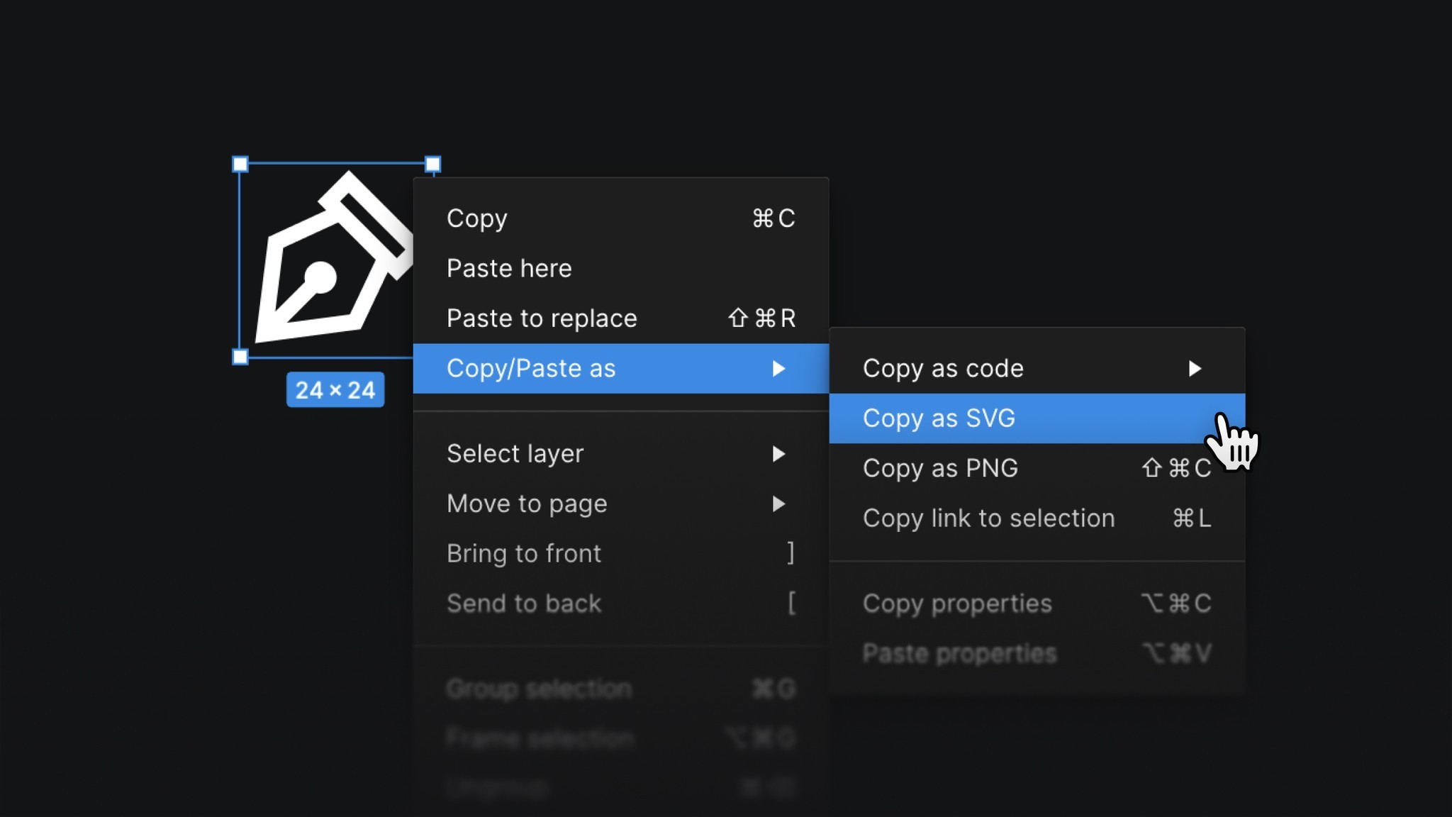
You can simply right-click the icon in Figma and copy it as SVG.

Once you have the SVG code, head over to the SVG component in Framer. After selecting it, you'll see the "SVG Code" property in the right panel. Just paste the SVG code into that property, and the component will display your icon.
